Here is the last one;

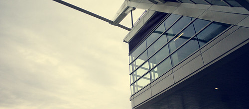
This was the background image used

I call this image cloud city, after cloud city from Empire Strikes back. I appreciate modernist architecture and cloud city is one of my all time favs.
The header this week is using the same format of the last header, mainly because I dont have photoshop on my computer. So I made a few headers with the same typography but different background images, in the computer lab before went on a break. I'll get more creative when I get back to school, and get to use the computer labs.

using

I call it monolith, inspired by 2001:A Space Odyssey. I'm a big Kubric buff.

i tried watching clockwork orange the other day-freaked me the hell out. i am NOT a kubrick fan. i'm far too uncool for that shit.
ReplyDeletechange the banner already - and this time we may even NOTICE the difference